Stampin’ Celebration #10

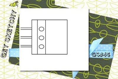
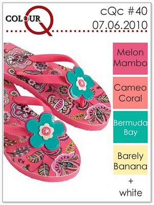
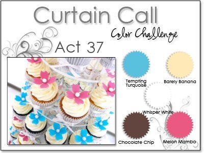
I had a lot of fun with this week’s Stampin’ Celebration inspiration photos! (Then again, I always do!) This week’s batch of photos features weddings, elegance and a color combination that I don’t use very often!
Here are this week’s inspiration photos:
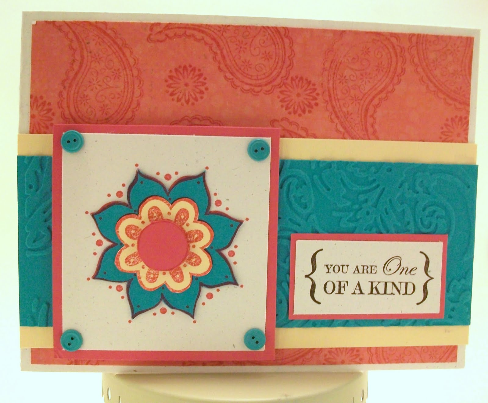
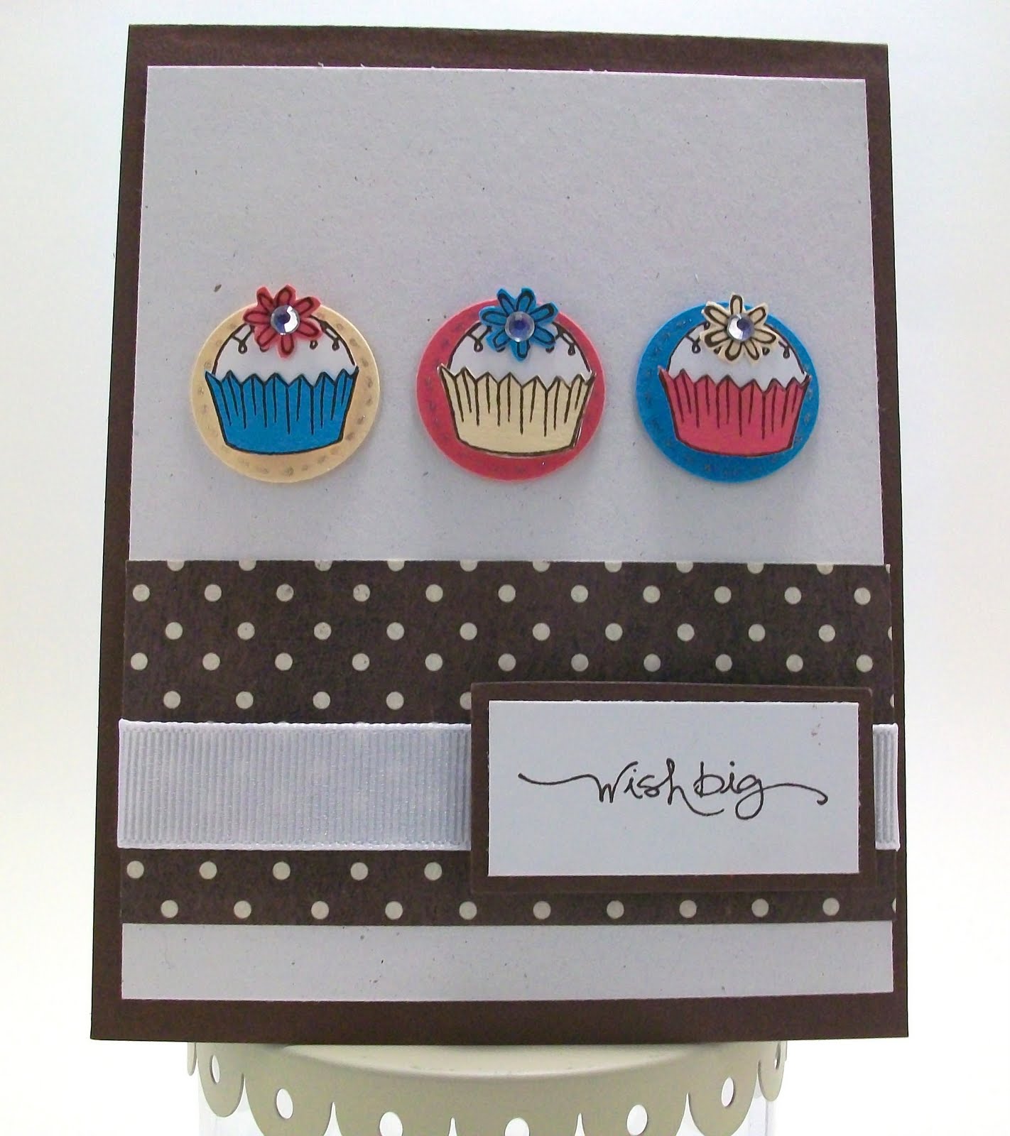
I decided to use the damask idea, but in yellow instead of black. I embossed a strip of white cardstock with a damask pattern for the bottom of the card.
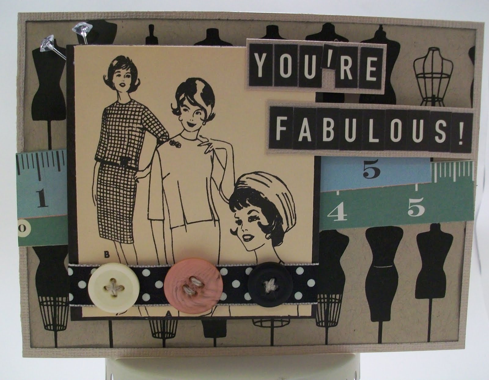
The paper I used is from October Afternoon’s “Thrift Shop” collection. The stamped image is from SU’s “Fun & Fast Notes” set, and the sentiment is from SU’s “Occasional Quotes” set. I colored the cakes with gel pens, and added a freehand white stripe border around the matting with a white pen.
 

Thanks for looking, and I hope you’ll play along with this week’s challenge, too!

Color Throwdown #100!

The Color Throwdown is celebrating its 100th challenge this week with fabulous guest designers and giveaways worth more than $1700! (For more details, and a complete list of prize sponsors, click HERE.)

Congratulations on 100 fantastic challenges, ladies…and wishing you many, many more!

Here are this week’s throwdown challenge colors, so you can celebrate and play along, too!

Even though it’s summertime, and most of the country is feeling the heat, my card features a different kind of warmth…hot chocolate! Of course, it’s more of a fall or wintertime image, but it was too cute to pass up for this week’s challenge!
The paper that I used is from KaiserCraft and American Crafts. I also used Stampin’ Up Cardstock in the challenge colors. The ribbon is by ki Memories, and the stamps are by Elzybells Art Stamps.
Thanks very much for looking…I hope you’ll celebrate with the Color Throwdown, too!

Stampin’ Royalty #27

This week’s Stampin’ Royalty challenge is to create a card, traditional or digital scrapbook layout, project or 3D project using the following sketch as your main inspiration:
I made a card for my entry, and used stamps by aMuse and Stampin’ Up, and paper from KaiserCraft, which I have been saving for a while. I took some time to figure out how I wanted to place the elements on the card…I wanted to stay relatively true to the sketch, but still include all the pieces of my design. I moved things around a few times and had to glue them down again!
I love this paper and these stamps together, mainly because I am a big fan the simplicity and elements of Asian design.

The fan and sentiment stamps are from the “Sushi” clear stamp set by aMuse Art Stamps. The main stamped image is from Stampin’ Up’s “Dream Garden” set. The paper and brad are from KaiserCraft. The ribbon is basic black grosgrain ribbon. I added the stitching with a copper gel pen.

Thanks so much for looking!

Get Sketchy #45

At first, I was stumped by this week’s Get Sketchy challenge, but after rotating one of the sketch elements and extending another, I came up with a “fabulous” card!

Here’s this week’s sketch, in case you’d like to play along …this week’s prize is a card kit from Kimosabe Scraps.

For my card, I rotated the middle square and carried the lines in the background across the card front.
The dressform paper is by Hambly Screen Prints. The letter stickers and vintage ladies are from October Afternoon (Thrift Shop collection). The ruler strips are from Cosmo Cricket (Material Girl collection). I used Core’dinations cardstock for the card base and to mount the letter stickers. I sewed linen thread through each button, and glue-dotted them to the ribbon. I added a final touch with two Maya Road trinket pins.
Thanks very much for looking!

colourQ #40

The inspiration photo for this week’s colourQ (#40) definitely puts me in a summer state of mind!

This past weekend, my husband & I met some friends in Tumwater for the July 4th fireworks. It definitely wasn’t summer weather…by the time the show started, we were all huddled under blankets, trying to keep warm! It was odd for it to be so chilly in July…at least it wasn’t raining! So, here’s to warmer weather and wearing flip-flops like the ones in the challenge photo!

I was inspired by the print on the flip-flops, so I stamped a paisley background with Melon Mambo ink on a piece of Cameo Coral-ish paper by Crate Paper.
I used Barely Banana and Bermuda Bay cardstock as accent strips, and embossed one with my Big Shot. I stamped the flower (also in Melon Mambo) on several different pieces of cardstock and pieced them together. I used natural white cardstock for the matted images and sentiment. The button brads are from Making Memories, and the stamps that I used are from Stampin UP’s “One of a Kind” set.
Thanks very much for looking!

CardPatterns #71

For this week’s CardPatterns sketch, I went through my stash and used some papers that I’d been saving for a while. I’ve been in a summer mood lately, and I thought a great way to celebrate summer is with some sweet strawberries!

Here’s the sketch, so you can play along, too!

For my card, I used papers from Doodlebug & KI Memories. One of my bad habits is buying lots of pretty paper, but never using it, so I’m trying my best to share some of my stash in the cards I make each week for challenges!
The brads are made with the i-Top tool and KI Memories paper. The strawberry stamps are from Stampin UP! and are part of the “Tart & Tangy” set (stamped in Green Galore and Melon Mambo ink). The sentiment is by Elzybells Art Stamps. The plaid paper is from Doodlebug, and the card base is SU Rose Red cardstock.
Thanks very much for looking!

Color Throwdown #99

This week’s Color Throwdown (#99) is the last one before the big 100th challenge celebration! Visit the Color Throwdown this Wednesday for the celebration’s kickoff…there are prizes up for grabs totalling more than $1600 from 31 fantastic companies! Click HERE for more details!

Here are the colors for Challenge #99:

My card is very simple this week, but I’m happy with how it came out!

The card base is Tempting Turquoise, which was embossed with a Big Shot. The gingham ribbon is by Making Memories. I used Bo Bunny Double Dot in Almond as a substitute for the cream color. I used Chocolate Chip cardstock and ink to stamp the image, which is part of a new Stampin’ Up hostess set named “Cute by the Inch.”

Thanks for looking, and I hope you’ll visit the Color Throwdown this week for the 100th Challenge Celebration…I definitely will!

CPS #174

This week’s Card Positioning Systems sketch (#174) was a fun one…it’s simple, but it got me thinking about different ways to position elements on my cards.

Here’s the sketch:

and this is the card that I made based on the sketch: 
My supply list:
Paper: graphic45, K & Company
Stamp: from “Puns from the Past” – Stampin’ Up!
Other: Basic Black ink (Stampin’ Up!), Cork accent (Pink Paislee), rub-on letters (Making Memories), ephemera (7 Gypsies), Glossy Accents, twill tape, brads.
Thanks for looking!

Curtain Call #37

To celebrate Stacey Schafer’s birthday this week, the latest Curtain Call Challenge at Stacey’s Stamping Stage features these fun colors, inspired by these tasty-looking cupcakes from Hello Sugar!

My husband’s birthday was a few weeks ago, but because he was away doing soldier-type things on his actual birthday, we didn’t get to celebrate until this weekend. I made him a German Chocolate cake (from scratch) using a recipe I found at the Betty Crocker web site. It’s a lot of work, but it’s delicious!
Using the challenge colors and cupcakes as inspiration, I made this card:
I used SU cardstock in the challenge colors, and also Natural White. The cupcakes and sentiment are stamped with Chocolate Chip ink. The cupcake stamps are from Elzybells Art Stamps, and the sentiment (and flower stamp) comes from SU’s “Short & Sweet” stamp set.
The polka-dot paper is from My Mind’s Eye. I added white grosgrain ribbon to the card, and glued rhinestones to each flower’s center.
Happy Birthday, Stacey!
&
Thank you all for visiting!

Stampin’ Celebration #9

In honor of July 4/Independence Day weekend, the inspiration photos for this week’s Stampin’ Celebration challenge are USA-inspired!

I chose the red, white and blue stripes as my inspiration for the card that I made. Also, I thought of ice cream when I saw the picnic photo…so I came up with this design:
To make the card background, I used strips of Real Red and Night of Navy cardstock, alternated on a Natural White cardstock background. I used kraft cardstock to mat the stamped images and sentiment. The stamps I used are from Stampin’ Up’s “Sweet Scoops” set.
I used Basic Blue, Real Red, Creamy Caramel, and Soft Suede inks.
I also used a Martha Stewart border punch, mini silver brads, white grosgrain ribbon, and cork accents from Pink Paislee’s 365 Degrees collection.
Thanks very much for looking!