Card Style Week: Classy & Elegant

Of all the cards that I’ve made this week in various styles, I think the hardest one for me was Classy & Elegant, because I kept wanting to put more stuff on the card, like I did with the Shabby and Vintage one!

Here’s some info on what makes a “Classy and Elegant” card, courtesy of Cath at Moxie Fab World:

The classy and elegant style is polished. A shiny finish, sparkling embellishments, a rich color scheme, and sophisticated sentiment treatments are all part of the classy and elegant pedigree. Its look is regal, stunning, and dashing. And while its lines are clean, sweeping, and dramatic, it can also incorporate monochromatic color schemes with layered textures that awe and impress equally as well.

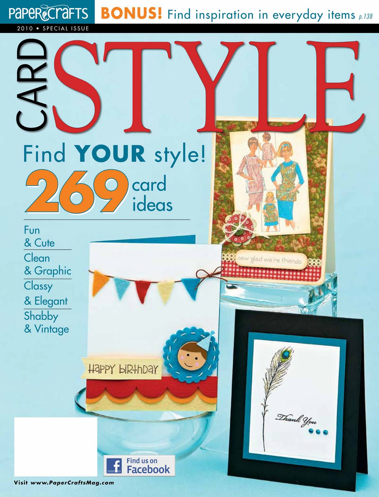
Moxie Fab World is celebrating Card Style Week with challenges that inspire you to create cards in each of the four styles featured in the Paper Crafts special issue that was just released: “Fun and Cute”, “Clean and Graphic”, “Shabby and Vintage” and “Classy and Elegant.”

Here’s my entry for the Card Style Classy and Elegant Challenge in the Moxie Fab World:

and this is the inside of the card:

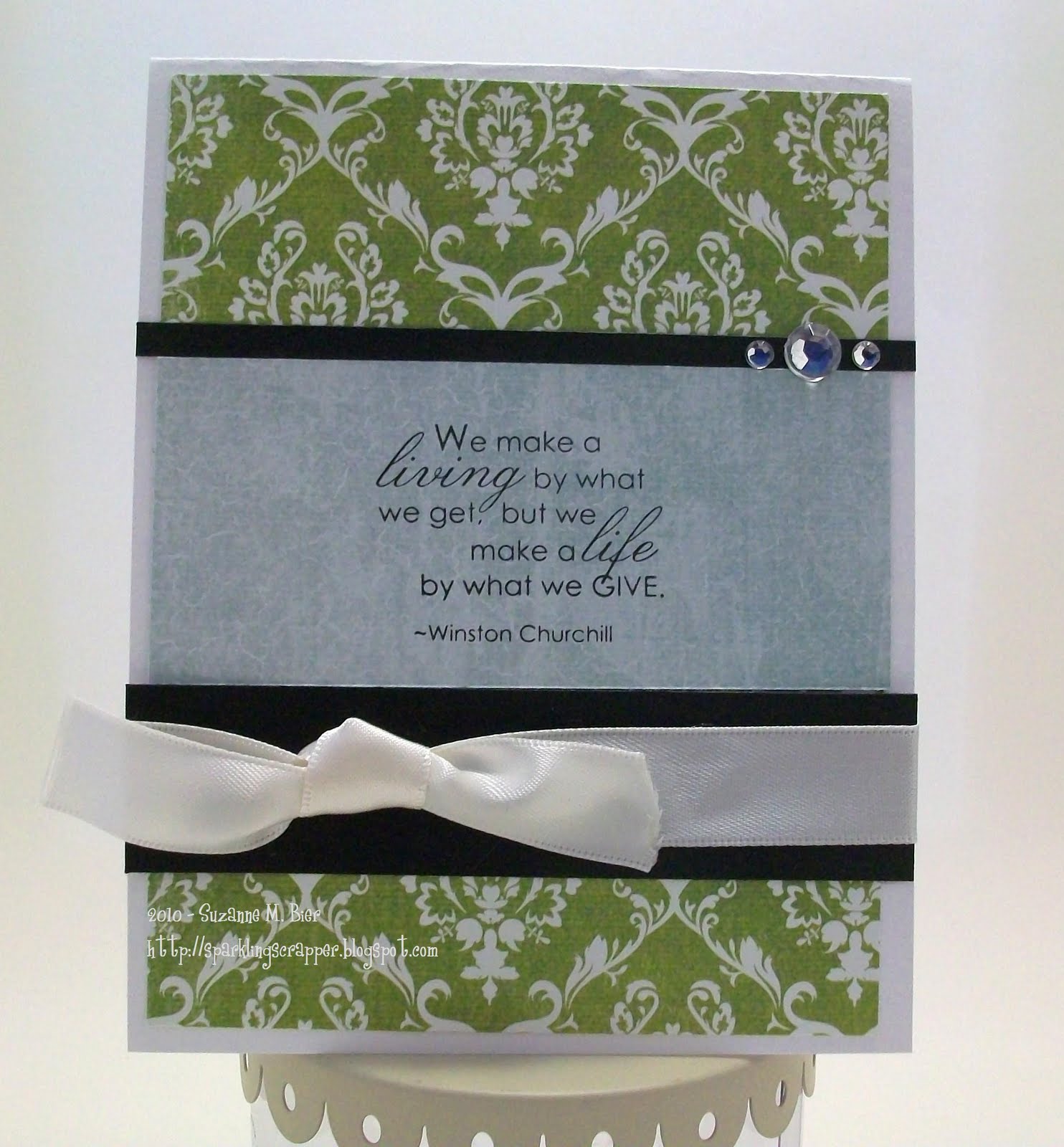
The background paper is from Pink Paislee’s 365 Degrees collection. I used SU cardstock in Natural White and Basic Black. The sentiment is from SU’s “Occasional Quotes” set, which is a new Level 3 Hostess Set. I stamped the sentiment in Basic Black ink and finished off the card with some adhesive rhinestones and satin ribbon.

All of the Card Style contests run until August 2 at midnight MDT…so there’s still time to get inspired and enter!

Card Style Week: Shabby & Vintage

Next up in Moxie Fab World’s Card Style Week Celebration: Shabby & Vintage! My personal style is usually in the “Fun & Cute” and “Clean & Graphic” categories, but from time to time, I’ve made cards in a more vintage style.

To celebrate the release of Paper Crafts’ special issue, Card Style, Moxie Fab World is hosting contests this week in each of the four styles featured in the magazine. Each contest runs until August 2 at midnight MDT. For more information, click HERE to visit Moxie Fab World!

Moxie Fab World’s Cath explains what defines the Shabby & Vintage style:

What makes a card shabby chic? Well, shabby chic is a style characterized by layering. It is soft, utilizing ribbon, lace, and techniques such as inking and distressing. The final product looks comfortable, weathered, and worn.

What makes a card vintage? Vintage goes a step further by adding old images, found items, and antique trinkets to the mix.

With those guidelines in mind, I created this card for the “Card Style Shabby Chic and Vintage Challenge in the Moxie Fab World”:

The card base is Bazzill cardstock embossed with a Tim Holtz folder in the Big Shot. I used paper by The Girls’ Paperie and the rose, photo corner, journaling spot and butterfly from an ephemera pack by K & Company. The ticket is by Tim Holtz.
The sentiment is from Stampin’ Up’s “Occasional Quotes”, which is one of the new hostess sets! I also added adhesive pearls by Prima, a scrap of lace, and a button to complete the card. I distressed the paper square and a few of the pieces on the card with the edge of my scissors.
Thanks very much for looking at my card…I hope you’ll also play along with Moxie Fab World’s challenges this week!

Card Style Week: Clean & Graphic

This week, Moxie Fab World is hosting a series of challenges to celebrate the release of Paper Crafts Magazine’s latest special issue — Card Style!

The second in this series of challenges is to create a card in the “Clean & Graphic” style. So, what makes a card “clean and graphic”? Cath from Moxie Fab World says:
Straight from the pages of Card Style magazine itself, the clean and graphic style is characterized by the utilization of white space, clean lines, and simple treatment of text. It is no-frills, bare-boned, modern, and hip. And while you might be surprised at how minimally clean and graphic cards might be embellished, you might also be amazed at how quickly their messages are communicated.

With that in mind, I created a card based on this style for the Card Style Clean and Graphic Challenge in the Moxie Fab World:

For the card base, I used smooth kraft cardstock and stamped oranges from SU’s “Tart & Tangy” set in Only Orange ink. I made a border strip with Whisper White and Pumpkin Pie cardstock and used an SRM sticker for the sentiment from the “Thinking of You” set. To finish the card, I used a tissue box stamp by Lockhart Stamps, colored it with a gel pen and a colored pencil, and used a foam square to pop it up!

Thanks for visiting and checking out my card…I hope you’ll play along with these challenges (and why not? The deadline is midnight MDT on August 2)! For more contest details, information and design inspiration, click HERE! Next up…shabby & vintage!

Moxie Fab World: Fun & Cute Card Style!

Paper Crafts Magazine just released a new special issue called Card Style, which features four styles of card making: fun and cute, clean and graphic, shabby chic and vintage, and classy and elegant. Here’s the cover of that special issue:

and to celebrate, Moxie Fab World is hosting contests for each style of card… First up, Fun and Cute!
Here’s the definition of the style, courtesy of Cath at Moxie Fab World:
What makes a fun and cute card? To begin with–a happy color scheme, a sweet sentiment, and an uncomplicated design. Throw in some whimsy (like cartoons and doodles), a few simple shapes (like hearts and stars), some friendly patterns (like polka dots and gingham), and voila! There’s a smile on your face and a song in your heart that’s unmistakably fun and cute.

Many of the cards that I make fit this style, so here’s my entry for the Card Style Fun and Cute Challenge in the Moxie Fab World:


I used SU kraft cardstock for the base, and combined a cute monkey stamp from Stampin’ Up (Fox & Friends set) with a branch stamp from aMuse (Sushi set). I fussy-cut a heart for the monkey to hold, and colored it with gel pens. The papers are from Cosmo Cricket and Sassafras. I used rub-ons from ScrapWorks to make the sentiment. The ribbon is from American Crafts.

There’s still time for you to play along, too! The contests run until midnight MDT on Monday, August 2. Click HERE for the contest rules and other details!

Thanks for visiting!

Unscripted Sketches #63

This month, Unscripted Sketches is celebrating Christmas In July! There’s something new every day on their blog, from guest designers (I was the guest designer for the first weekend in July), journaling tips, free downloadables, and more! (Click HERE to join in the fun!)

I forgot that there was a bonus color challenge this week (although the colors are in my card “somewhere” by chance), but I did make my card based on the sketch:

I rotated the sketch and went with a cool theme (although not Christmas) … icy treats!

 
I grew up in South Louisiana, and one of the best parts of summertime there was getting sno-balls (sometimes referred to as sno-cones or shaved ice in other parts of the country)! Nothing was better at cooling me down on a hot, muggy summer day than a cold, sweet sno-ball…lots of sugary syrup poured over finely shaved ice…delicious!
 
I found a sno-ball stamp at a craft store other day in the dollar bin and couldn’t wait to use it on a card! I altered it with a craft knife to remove the tropical umbrella.


The three sno-balls are stamped in Only Orange, Perfect Plum, and Real Red. I added Frosted Lace Stickles to give the images a “snowy” look. I punched three circles for a background and popped them up with foam squares. The paper I used is from American Crafts’ HeatWave collection. The Thickers are also from American Crafts. The cardstock I used is from Stampin’ Up; it was embossed in the Big Shot with a Tim Holtz folder.
Thanks very much for looking…I hope you will visit Unscripted Sketches and celebrate Christmas in July!

colourQ #41

It’s been a while since I bought the stamp that I used on the card that I made for colourQ #41. I love buying the little dollar stamps that Imaginisce releases with each collection, although sometimes it takes a while for me to actually use them!

This week’s colourQ inspired me to use a cute poodle stamp that I’ve been holding on to! The challenge colors and inspiration photo for this week got me thinking of a girly, chic card:

and voila! Here’s the card that I came up with!

The paper I used is by Pink Paislee. I embossed the card base with the Big Shot and a Tim Holtz folder. The stamp is from Imaginisce’s “Perfectly Posh” collection. After stamping it in Basic Black ink, I colored it with SU pastels and a gel pen. I ink-jet printed the sentiment (the font that I used is called Susie’s Hand) and mounted it on Pretty In Pink cardstock. The gem brad in the center of the ribbon bow is also by Imaginisce.
Thanks for looking! I hope you’ll be inspired to play along with the colourQ too!

CardPatterns #72

This week’s CardPatterns sketch is great for using up scraps of your favorite patterned paper! I chose to work with some of Cosmo Cricket’s DeLovely collection for my card.

Here’s this week’s sketch, so you can play along, too!

The stamp that I used on my card is from SU’s “Chic Boutique” set. It’s one of my favorite stamps…I’ve used it on lots of cards! The letter stickers are from My Little Shoebox. I added a strip of ruler paper from Cosmo Cricket’s “Material Girl” collection in place of the ribbon or thread accent on the sketch.
I think my favorite part of my card is the flower accent! I used all three sizes of my i-Top punches to make it. I cut slits in between each “petal” and curled them upward. I layered the punched pieces on top of each other, and threaded a piece of ribbon through a button for the flower’s center. Very easy to make!
I added the stitching details with a copper gel pen and used a glitter gel pen to color in the dressform stand.
Thanks so much for looking! I hope you’ll play along with CardPatterns, too!

Curtain Call #38

I was definitely challenged by the color combo this week over at Stacey’s Stamping Stage! It’s a beautiful color combo, but I wasn’t quite sure how to work all of the colors in at first…so I kept my card relatively simple (but I managed to get them all in!). Here’s the inspiration photo and color palette!

For my card, I used paper from Basic Grey’s Olivia collection, some Core’dinations pearlized cardstock, some vanilla ribbon , and ink by Stampin’ Up! The stamps that I used were a birthday stamp by Savvy Stamps and a sentiment stamp from SU’s “Occasional Quotes” set.
I embossed the pink cardstock with the Big Shot, and worked in the Pumpkin Pie cardstock as a mat for the stamped image. I colored the image with colored pencils, and stamped the icing part of the cake on Rich Razzleberry cardstock. The sentiment is stamped in Old Olive, and is matted on Certainly Celery cardstock.
Thanks very much for looking at my card, I hope you’ll play along with the Curtain Call challenge, too!

CPS #175

Normally, I’m not a fan of going to the beach, but now that it’s summertime, I’ve been thinking of beachy colors and ideas for making cards! For this week’s CPS sketch (#175), I chose some stamps that a friend gave me…I thought they’d be perfect!

Here’s this week’s CPS sketch:

For my card, I used Bazzill cardstock, and papers from SEI, Bo Bunny and KaiserCraft. The beach tote and sandals are CTMH stamps, and the sentiment is from Elzybells Art Stamps. The images were stamped with SU ink in Chocolate Chip, Soft Suede and Basic Blue. I colored the images with colored pencils and gel pens. To make the sand, I used Frayed Burlap Distress Stickles.
Thanks for visiting & looking at my card!

Get Sketchy #46

I think I do some of my best work late at night…I’m probably not the only one who feels that way! Things are much quieter then, and I find that I don’t “overthink” my cards and projects as much as when I’m working on something during the day.

At first, I was a bit intimidated by this week’s Get Sketchy challenge (#46). I wasn’t sure how I’d fit everything onto one card without it looking too busy, but crafting at night helped my creative process on this one. The iced coffee that I drank this afternoon probably helped a bit, too!

Here’s the sketch…I hope you’re inspired to play along! This is a fun one!

For my card, I rotated the sketch, and went with a coffee theme!
The sentiment and coffee bean stamps are from Crafty Secrets (Tea & Coffee set), and the coffee go-cup is by Elzybells Art Stamps. The background paper is from Jillibean Soup. I used Bo Bunny Double Dot as the background for the sentiment stamp. The ribbon is by Stampin’ Up!
Instead of one long strip of paper, I made a mosaic out of the stamped background.  I stamped the sentiment and coffee beans on kraft paper (SU Chocolate Chip ink). One of the hardest parts was cutting out the espresso grinder…I didn’t realize how thin the paper was! I colored the coffee cups with a bronze gel pen.
Thanks very much for looking!