Curtain Call #39

There’s a very cool color combo in this week’s Curtain Call Challenge over at Stacey’s Stamping Stage! I enjoy these challenges, because they get me inspired by color combos that I wouldn’t normally use in my crafting!

I substituted some similar patterned paper for the Wild Wasabi color, and I used Kiwi Kiss for the Certainly Celery. I stamped the tree image in Old Olive and the sentiment and woodgrain background in Soft Suede.
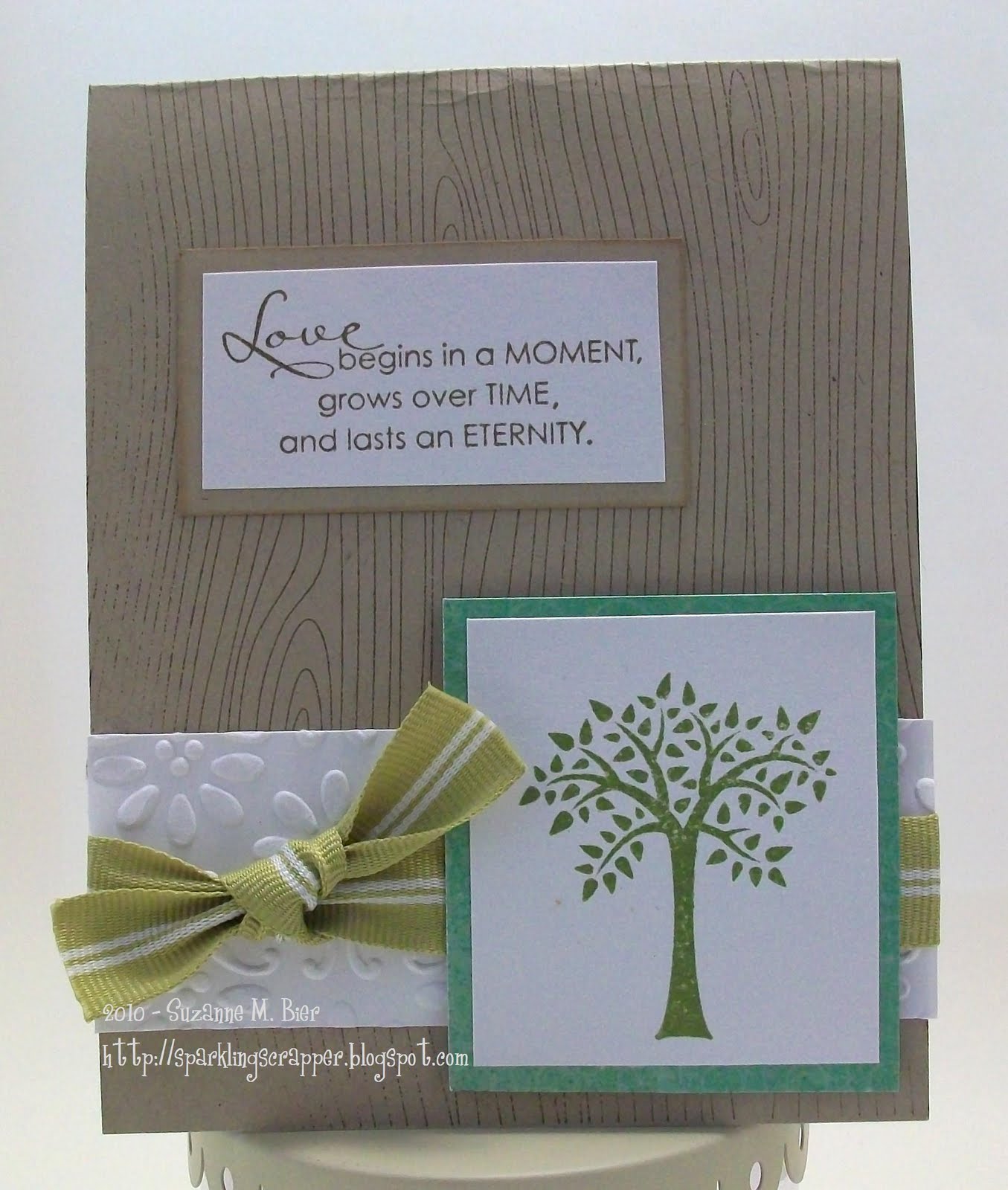
The tree stamp is from Stampin’ Up’s “Forest Friends” set, and the sentiment is from the new Level 3 Hostess set, “Occasional Quotes.”
I embossed a strip of white cardstock in the Big Shot and used some paper from Crate Paper’s Brook collection to mat the stamped tree image. The background stamp is from Stampin’ Up! (I still need to work on my inking technique for the really big stamps!) I used SU kraft cardstock for the card base.

Thanks so much for visiting! Hope you’ll visit Stacey’s Stamping Stage this week and play along with the latest Curtain Call!

Get Sketchy #47

I had a lot of fun with this week’s challenge at Get Sketchy (#47)! At first glance, it appears to be pretty simple, but offers lots of possibilities for great cards!

For my card, I used papers from 3 Bugs in a Rug (Savannah Collection), small heart stamps from Elzybells Art Stamps, and a doughnut stamp by Hero Arts.
I used SU Melon Mambo and Chocolate Chip inks to do the stamping on the card. I stamped the doughnut twice, once for the actual doughnut, and again on pink cardstock for the icing. Then I used a copper gel pen to create the stitching effect, and gel pens to color in the doughnut sprinkles. The sentiment is also from Elzybells Art Stamps.
Thanks for visiting and I hope you’ll play along with Get Sketchy this week!

Stampin’ Celebration #11

This week’s Stampin’ Celebration challenge is all about summer! If you haven’t played along with their challenges yet, why not give it a try? Each set of inspiration photos is full of great elements to get your creative ideas flowing!

For example, here are the inspiration photos for this week’s challenge (#11):

Very cool! For my card, I took inspiration from the lemonade, with the splashes of red and blue. Since I don’t have a yellow ink pad, I used yellow cardstock and a watermark ink pad to create the background for my card!
The stamps I used are a margarita stamp by A Muse Art Stamps, letter stamps by Inkadinkado, flowers from Stampin’ Up’s “Eastern Blooms” set, and the lemon/lime/orange stamp from SU’s “Tart & Tangy” set. I used VersaMark watermark ink for the flowers and background, Real Red for the sentiment, and Chocolate Chip ink for the “frozen lemonade” drinks. I colored the drinks with a fine-tipped pen and a Stardust glitter pen. I embossed a strip of red cardstock with the Lattice folder in the Big Shot.
Thanks very much for looking at my card…I hope you’ll play along with Stampin’ Celebration!

Color Throwdown #101

Last week, the Color Throwdown celebrated its 100th challenge with a blog hop, a color challenge, and a massive prize giveaway! Congratulations on 100+ challenges, ladies! Here’s to many more!

This week’s challenge (#101) is a great color combination…

For my card, I used kraft as the card base and embossed it with a Tim Holtz folder in the Big Shot. The sentiment and dressform stamps are by Stampin’ Up! (from the “One of a Kind” and “Chic Boutique” sets) The thread spool, button and pin stamps are by Hero Arts. I used paper by My Mind’s Eye, American Crafts and SU Cardstock to complete the card.
I used Soft Suede ink to stamp the images. I cut the pin stamp and glued it in two places to make it look like it was stuck through the white cardstock, and I also strung linen thread through the center of the cardstock button. To make the ribbon spools, I stamped the thread portion on different colors of cardstock using white chalk ink, cut them out and glued them on the spool bases.
Thanks very much for looking…I hope you’ll play along with the Color Throwdown, too!

Card Style Week: Classy & Elegant

Of all the cards that I’ve made this week in various styles, I think the hardest one for me was Classy & Elegant, because I kept wanting to put more stuff on the card, like I did with the Shabby and Vintage one!

Here’s some info on what makes a “Classy and Elegant” card, courtesy of Cath at Moxie Fab World:

The classy and elegant style is polished. A shiny finish, sparkling embellishments, a rich color scheme, and sophisticated sentiment treatments are all part of the classy and elegant pedigree. Its look is regal, stunning, and dashing. And while its lines are clean, sweeping, and dramatic, it can also incorporate monochromatic color schemes with layered textures that awe and impress equally as well.

Moxie Fab World is celebrating Card Style Week with challenges that inspire you to create cards in each of the four styles featured in the Paper Crafts special issue that was just released: “Fun and Cute”, “Clean and Graphic”, “Shabby and Vintage” and “Classy and Elegant.”

Here’s my entry for the Card Style Classy and Elegant Challenge in the Moxie Fab World:

and this is the inside of the card:

The background paper is from Pink Paislee’s 365 Degrees collection. I used SU cardstock in Natural White and Basic Black. The sentiment is from SU’s “Occasional Quotes” set, which is a new Level 3 Hostess Set. I stamped the sentiment in Basic Black ink and finished off the card with some adhesive rhinestones and satin ribbon.

All of the Card Style contests run until August 2 at midnight MDT…so there’s still time to get inspired and enter!

Card Style Week: Shabby & Vintage

Next up in Moxie Fab World’s Card Style Week Celebration: Shabby & Vintage! My personal style is usually in the “Fun & Cute” and “Clean & Graphic” categories, but from time to time, I’ve made cards in a more vintage style.

To celebrate the release of Paper Crafts’ special issue, Card Style, Moxie Fab World is hosting contests this week in each of the four styles featured in the magazine. Each contest runs until August 2 at midnight MDT. For more information, click HERE to visit Moxie Fab World!

Moxie Fab World’s Cath explains what defines the Shabby & Vintage style:

What makes a card shabby chic? Well, shabby chic is a style characterized by layering. It is soft, utilizing ribbon, lace, and techniques such as inking and distressing. The final product looks comfortable, weathered, and worn.

What makes a card vintage? Vintage goes a step further by adding old images, found items, and antique trinkets to the mix.

With those guidelines in mind, I created this card for the “Card Style Shabby Chic and Vintage Challenge in the Moxie Fab World”:

The card base is Bazzill cardstock embossed with a Tim Holtz folder in the Big Shot. I used paper by The Girls’ Paperie and the rose, photo corner, journaling spot and butterfly from an ephemera pack by K & Company. The ticket is by Tim Holtz.
The sentiment is from Stampin’ Up’s “Occasional Quotes”, which is one of the new hostess sets! I also added adhesive pearls by Prima, a scrap of lace, and a button to complete the card. I distressed the paper square and a few of the pieces on the card with the edge of my scissors.
Thanks very much for looking at my card…I hope you’ll also play along with Moxie Fab World’s challenges this week!

Card Style Week: Clean & Graphic

This week, Moxie Fab World is hosting a series of challenges to celebrate the release of Paper Crafts Magazine’s latest special issue — Card Style!

The second in this series of challenges is to create a card in the “Clean & Graphic” style. So, what makes a card “clean and graphic”? Cath from Moxie Fab World says:
Straight from the pages of Card Style magazine itself, the clean and graphic style is characterized by the utilization of white space, clean lines, and simple treatment of text. It is no-frills, bare-boned, modern, and hip. And while you might be surprised at how minimally clean and graphic cards might be embellished, you might also be amazed at how quickly their messages are communicated.

With that in mind, I created a card based on this style for the Card Style Clean and Graphic Challenge in the Moxie Fab World:

For the card base, I used smooth kraft cardstock and stamped oranges from SU’s “Tart & Tangy” set in Only Orange ink. I made a border strip with Whisper White and Pumpkin Pie cardstock and used an SRM sticker for the sentiment from the “Thinking of You” set. To finish the card, I used a tissue box stamp by Lockhart Stamps, colored it with a gel pen and a colored pencil, and used a foam square to pop it up!

Thanks for visiting and checking out my card…I hope you’ll play along with these challenges (and why not? The deadline is midnight MDT on August 2)! For more contest details, information and design inspiration, click HERE! Next up…shabby & vintage!

Moxie Fab World: Fun & Cute Card Style!

Paper Crafts Magazine just released a new special issue called Card Style, which features four styles of card making: fun and cute, clean and graphic, shabby chic and vintage, and classy and elegant. Here’s the cover of that special issue:

and to celebrate, Moxie Fab World is hosting contests for each style of card… First up, Fun and Cute!
Here’s the definition of the style, courtesy of Cath at Moxie Fab World:
What makes a fun and cute card? To begin with–a happy color scheme, a sweet sentiment, and an uncomplicated design. Throw in some whimsy (like cartoons and doodles), a few simple shapes (like hearts and stars), some friendly patterns (like polka dots and gingham), and voila! There’s a smile on your face and a song in your heart that’s unmistakably fun and cute.

Many of the cards that I make fit this style, so here’s my entry for the Card Style Fun and Cute Challenge in the Moxie Fab World:


I used SU kraft cardstock for the base, and combined a cute monkey stamp from Stampin’ Up (Fox & Friends set) with a branch stamp from aMuse (Sushi set). I fussy-cut a heart for the monkey to hold, and colored it with gel pens. The papers are from Cosmo Cricket and Sassafras. I used rub-ons from ScrapWorks to make the sentiment. The ribbon is from American Crafts.

There’s still time for you to play along, too! The contests run until midnight MDT on Monday, August 2. Click HERE for the contest rules and other details!

Thanks for visiting!

Unscripted Sketches #63

This month, Unscripted Sketches is celebrating Christmas In July! There’s something new every day on their blog, from guest designers (I was the guest designer for the first weekend in July), journaling tips, free downloadables, and more! (Click HERE to join in the fun!)

I forgot that there was a bonus color challenge this week (although the colors are in my card “somewhere” by chance), but I did make my card based on the sketch:

I rotated the sketch and went with a cool theme (although not Christmas) … icy treats!

 
I grew up in South Louisiana, and one of the best parts of summertime there was getting sno-balls (sometimes referred to as sno-cones or shaved ice in other parts of the country)! Nothing was better at cooling me down on a hot, muggy summer day than a cold, sweet sno-ball…lots of sugary syrup poured over finely shaved ice…delicious!
 
I found a sno-ball stamp at a craft store other day in the dollar bin and couldn’t wait to use it on a card! I altered it with a craft knife to remove the tropical umbrella.


The three sno-balls are stamped in Only Orange, Perfect Plum, and Real Red. I added Frosted Lace Stickles to give the images a “snowy” look. I punched three circles for a background and popped them up with foam squares. The paper I used is from American Crafts’ HeatWave collection. The Thickers are also from American Crafts. The cardstock I used is from Stampin’ Up; it was embossed in the Big Shot with a Tim Holtz folder.
Thanks very much for looking…I hope you will visit Unscripted Sketches and celebrate Christmas in July!

colourQ #41

It’s been a while since I bought the stamp that I used on the card that I made for colourQ #41. I love buying the little dollar stamps that Imaginisce releases with each collection, although sometimes it takes a while for me to actually use them!

This week’s colourQ inspired me to use a cute poodle stamp that I’ve been holding on to! The challenge colors and inspiration photo for this week got me thinking of a girly, chic card:

and voila! Here’s the card that I came up with!

The paper I used is by Pink Paislee. I embossed the card base with the Big Shot and a Tim Holtz folder. The stamp is from Imaginisce’s “Perfectly Posh” collection. After stamping it in Basic Black ink, I colored it with SU pastels and a gel pen. I ink-jet printed the sentiment (the font that I used is called Susie’s Hand) and mounted it on Pretty In Pink cardstock. The gem brad in the center of the ribbon bow is also by Imaginisce.
Thanks for looking! I hope you’ll be inspired to play along with the colourQ too!